Why This Site Is Built in Lavender
Everything here is intentional. This is why.
There is a strategy for keeping a population disoriented. Steve Bannon described it plainly: flood the zone. The mechanism is not propaganda in the traditional sense. It does not require a single coordinated lie. It requires an overwhelming volume of competing claims, images, crises, and contradictions, delivered faster than the mind can resolve them. The result is not confusion. The result is retreat. The nervous system, unable to process the volume, drops into survival mode. Short-term. Reactive. Unable to hold a coherent position from one week to the next because the research confirms that the brain cannot store a data stream that dense. Last week’s outrage is gone because something arrived to replace it before it could settle.
This is not an accident. It is a system. And it is working exactly as intended.
The antidote is not more information. It is not a better argument. It is intentionality. The practice of choosing, consciously and repeatedly, where your attention goes, what you allow into the instrument, and what you build your environment from. Not as an act of resistance. As a way of remaining yourself.
This site is an attempt to demonstrate that practice at the level of design. Every element was chosen with awareness of what it does. None of it is arbitrary. This article explains the choices, not to defend them, but because showing the reasoning is itself the teaching. If you can see that this was built with intentionality, you can begin to notice what was built without it. And that noticing is where the practice starts.
Color does not exist in the world
This is worth sitting with. The world does not contain color. Light arrives at the eye as electromagnetic radiation at different wavelengths. The visual cortex assembles those wavelengths into the experience of color, a construction charged with meaning through evolution, culture, and lived experience before any conscious interpretation begins. You are not receiving color passively. You are generating it, and the meaning arrives with it, below awareness, faster than thought.
This means that choosing the colors of an environment is an intervention at the level of how reality is assembled, not merely how it feels. Most wellness content is consumed inside an interface engineered to produce the opposite of what the content recommends. High contrast, red notification badges, infinite scroll, algorithmic urgency. The platform has your nervous system before the first sentence does. It is asking you to regulate while keeping you in exactly the state that makes regulation hardest.
The background here is a soft lavender. The brain has a frequency of relaxed alertness called alpha, the state that appears during meditation and breathwork, the state in which the prefrontal cortex stays accessible and the body is not running threat simulations. It is the frequency at which genuine reading, genuine absorption, and genuine change become possible. Blocking it is the beta state: anxiety, high activation, the brain scanning for threat. The platform you were just on was producing beta. Research on color and neural arousal has established that cool, low-saturation tones measurably reduce beta wave activity. The lavender does not add something. It removes the interference. It clears the way for the state that was always available underneath the noise. The site begins that work before you read a word, because the content cannot do its job inside a nervous system that is already spiked.
A note on precision: the most documented EEG research on lavender concerns the scent, via the olfactory system. Color operates through a different pathway, the visual cortex and its downstream effects on arousal and affect. Both point toward the same outcome. The science for each stands independently.
The amber is the signal color, every button, every link, everything that asks you to move. Warm activation without threat. The color of firelight, earth, the hour before dark. It draws the eye without alarming the body. Everything else in the palette steps back. The colors are not a theme. They are a set of instructions to the nervous system, assembled by the brain before a single word is read.
The type carries something
The title font is named after Fraunces Tavern in lower Manhattan, where George Washington gave his farewell address to his officers at the end of the Revolutionary War. Whatever those men were carrying, whatever the years had made of them, they stood in that room and something was concluded. Something was set down so that something else could be carried forward.
A font named after that moment carries something of it into every heading it touches. There is an eccentricity to it, a warmth and slight irregularity that keeps it from feeling cold or institutional. The question it holds, without stating it, is the question the whole site holds: what are you leaving behind so that you can move forward?
The body text has a warm, chocolatey quality on screen. It reads the way it feels to be spoken to by someone who knows what they are talking about and is not in a hurry. The editorial layer, the labels and series markers and article numbers, carries the quality of a field notebook. Something recorded deliberately, because what was being documented mattered enough to write down. These are not aesthetic choices applied on top of the content. They are part of how the content arrives.
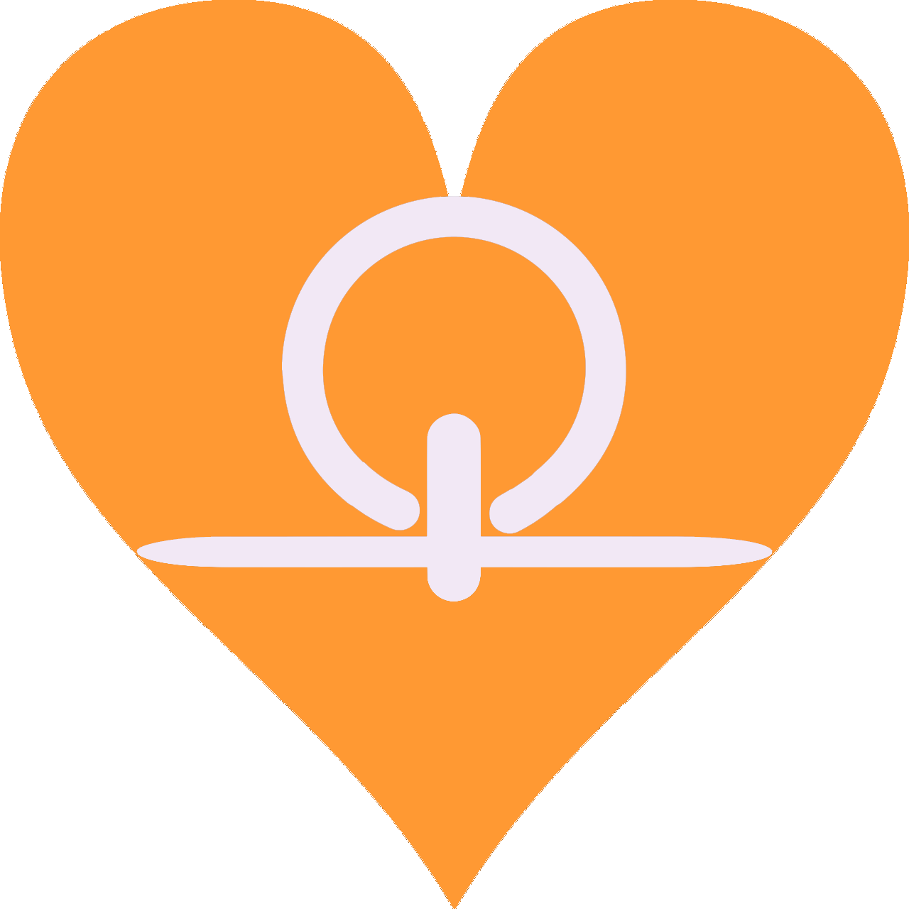
The home button is a heart for a reason
In the corner of every page is a small amber heart. It is the navigation home. The instruction embedded in it is older than any religion that has survived long enough to be documented: when you are lost, return to the heart. Not as sentiment. As navigational fact. The heart knows things the skull brain has not yet caught up to. Every tradition that has lasted has said some version of this. The research now has a mechanism for why.
The gut brain is the oldest intelligence in the body. It arrived before the skull brain by hundreds of millions of years. The skull brain is the most recently evolved, the narrator, the one that second-guesses and rationalizes and can be captured by fear. Between them sits the heart. HeartMath Institute research spanning three decades has documented what the traditions already knew: the heart generates the body’s most powerful electromagnetic field, measurable several feet beyond the body. It sends more signals to the brain than the brain sends to it. And the quality of that signal, ordered or disordered, coherent or fragmented, determines the quality of what you broadcast into the field around you.
The heart is the bridge. Between the ancient gut intelligence and the newer cognitive one. Between what the body knows and what language can articulate. Between your internal state and what you send outward into the field. It is the organ through which you interact with the world beyond your skin. Making it the home button is the most accurate choice available. When the stream takes you, you know where to return.
Inside the heart: a geometry that was always there
Inside the heart icon is the shen ring, one of the oldest symbols in recorded history, appearing in Egyptian artifacts from the First Dynasty around 3000 BCE. Shenu means to encircle. The shen ring was carried by Horus above the pharaoh to confer what Egyptologists call eternal royal encircling protection. A closed loop of rope. No beginning. No end. Energy cannot be created or destroyed. The loop holds.
Set within the shen ring is a reference to Frank Chester, an artist and geometer in California who in 2000 discovered a seven-sided geometric form he named the Chestahedron. His name is Chester. The form is called the Chestahedron. You cannot make this up.
When Chester spun the Chestahedron in a vortex of water at 36 degrees, the angle at which the human heart sits inside the chest, a secondary pocket-shaped vortex formed beside the primary one. He cut a cross-section of what formed. It matched a dissection of the human heart. The heart is not a mechanical pump. It is a vortex organizer. The shape it generates in the blood, and by extension in the field around the body, is toroidal, the same field shape that appears at every scale of organized matter, from the atom to the galaxy. The heart is generating that field continuously. It is the human body’s primary interface with everything beyond itself. The bridge between inner and outer. Between what you carry and what you send.
The compound symbol holds: eternal protection, within activation, within the organ that bridges the oldest intelligence and the newest one and sends what you are into the field. On a site about intentionality, this is the most precise symbol available. Nothing here was picked for how it looked.
The Eye of Horus
The site’s primary emblem is the Eye of Horus inside a triangle. In Egyptian mythology it represents protection, royal power, and the capacity to perceive beyond ordinary sight. The triangle holds it in the oldest symbol of stable structure, the form that distributes force without collapsing. Together: perception that survives what tried to destroy it, held in stable form.
There is something else here worth noting. When a sagittal cross-section of the human brain is overlaid with the Eye of Horus, the correspondence is exact. The pineal gland aligns with the pupil. The thalamus forms the main body of the eye. The corpus callosum curves above it like the eyebrow. Whether the ancient Egyptians encoded this intentionally or arrived at the same geometry through a different route is genuinely open. Neuroscientists have observed the correspondence. What it suggests is that the symbol may have always been pointing at the same thing it points at now: the seat of perception, in the center of the skull, where the inner world and the outer world meet.
Equanimity is the practice. The site models it.
Across the books and the site, the voice does not hurry. It does not perform urgency. It does not tell you how to feel about what you are reading. This is not a stylistic preference. Equanimity is the state the practice is asking you to develop, and the only honest way to ask for it is to lead from it.
This extends into language itself. The words you speak, the stories you run, the charge you carry in how you describe your own life: these are not neutral. They are shaping the field you broadcast. Equanimity in speech is not a performance of calm. It is the practice of holding all possibility open rather than collapsing into a story. No charge. No fixed narrative. Present. When you speak from that place you are not foreclosing what can arrive. You are in the frequency of creation rather than the frequency of reaction.
If the writing is doing what it claims, you should feel, not merely understand, the difference between something trying to spike your nervous system and something that is not. That equanimity is not just tone. It is one layer in a practice that compounds. This is called stacking: building layer by layer until the effect is no longer the sum of the parts but something the parts could not produce individually. The color regulates before the content starts. The type creates the reading state. The symbols signal meaning before the mind has read them consciously. The voice holds steady. The articles build from simple to complex, each one opening the next. By the time a reader reaches the later layers of the Arc, they are reading from a different place than they started. That is the design. Each element was optimized. The layers compound.
This is also what is available to anyone. Not the site. The practice of choosing, carefully and consciously, what every element of your environment is doing to you. Most of the environments people inhabit were built with no awareness of that question. The lighting was chosen for cost. The layout for density. The interface for engagement, which is to say, for activation. Nobody asked what the nervous system would do inside it over years.
The zone will keep flooding. The drama will keep arriving. The survival loop will keep running if you let it. The question is not whether the system is doing this. The question is whether you noticed. And whether, having noticed, you chose.
Everything here is intentional. That is the point.
The Sovereignty Arc
The space you inhabit is doing something to you / How urgency became the override / The witness and the constructed self
- Meeter M, Murre JMJ (2006). Remembering the news: Modeling retention data from a study with 14,000 participants. Memory and Cognition. PMID:16383168.
- Sweller J (1988). Cognitive load during problem solving: Effects on learning. Cognitive Science. 12(2):257-285.
- Bannon S. “Flood the zone” strategy documented in Green J (2017). Devil’s Bargain. Penguin Press, and multiple published interviews.
- Sato S, et al. (2021). Essential oil aroma stimulation for enhancing slow-wave EEG in sleeping brain. Scientific Reports. PMC7806966.
- BMC Neuroscience (2024). Effects of multi-colour light filtering glasses on human brain wave activity. 10.1186/s12868-024-00865-0.
- Scientific Reports (2023). Brain activity characteristics of RGB stimulus: an EEG study. 10.1038/s41598-023-46450-z.
- HeartMath Institute. Research on heart coherence, electromagnetic field, and heart-brain communication. heartmath.org.
- McCraty R (2015). The Energetic Heart: Bioelectromagnetic Communication Within and Between People. HeartMath Institute.
- Frank Chester. The Chestahedron. frankchester.com.
- Grokipedia / Wikipedia. Shen ring. Gardiner sign V9. First Dynasty origins c.3000 BCE.
- Eye of Horus and brain cross-section correspondence: observed by neuroscientists and documented in multiple anatomical comparisons. Whether intentionally encoded by ancient Egyptians remains an open scholarly question.
- Note: The alpha wave research on lavender documents effects of the essential oil scent via the olfactory system. The color research documents a related but distinct mechanism via the visual cortex.